My main artistic goal is to draw and paint like the old masters did. So I figured it would be a good idea to paint a master copy with oil colours. I already did some master copies but only with pencils or pastels.
For this painting I’ve chosen a portrait by John Singer Sargent from 1881 which depicts Marie-Louise Pailleron. Sargent is known for his detailed as well as impressionistic style. It is said, that he painted directly with the brush without making a preliminary drawing.
This is the painting from Sargent:
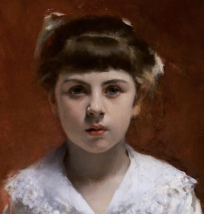
You can see his detailed approach on the face and his more loose and impressionistic style on the clothes.
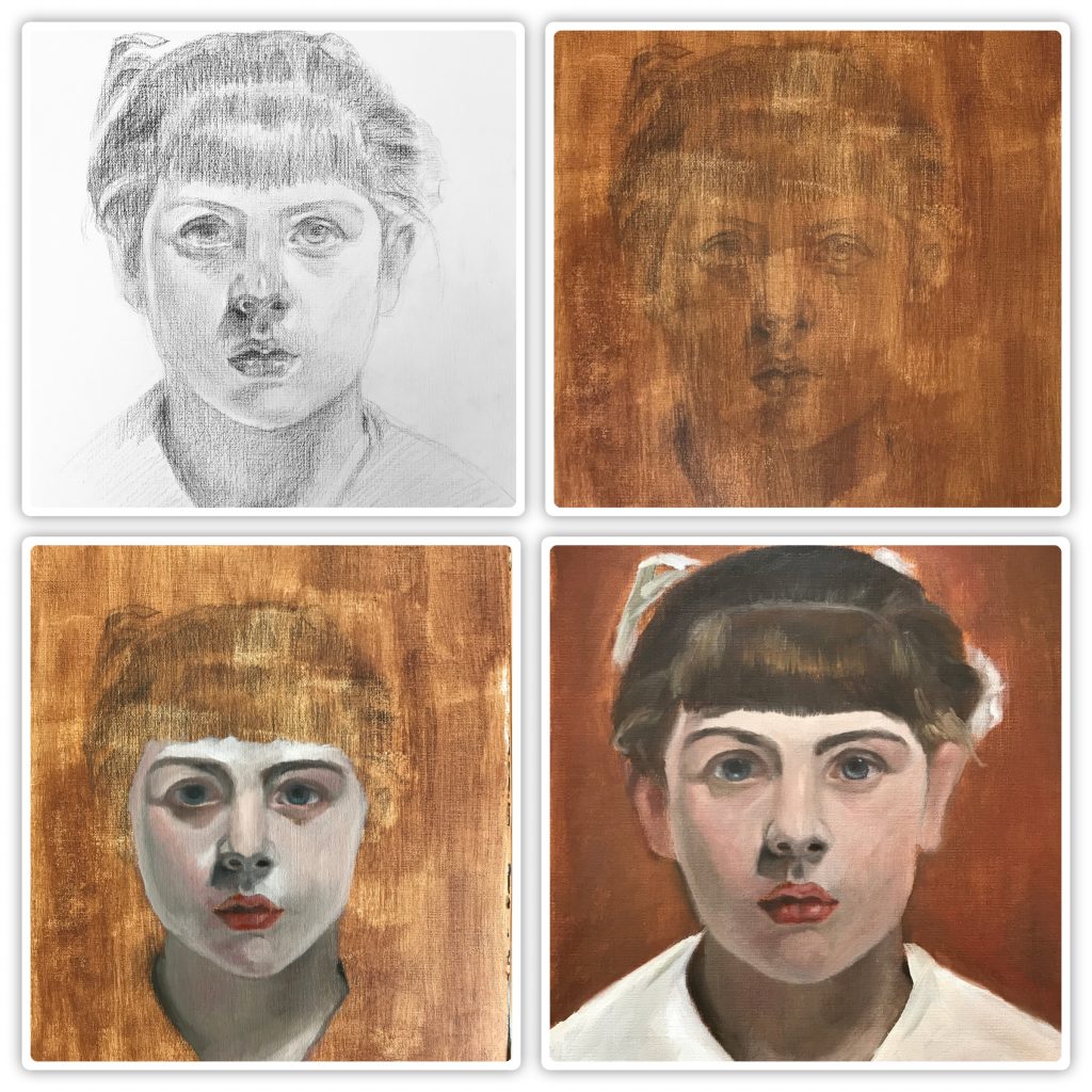
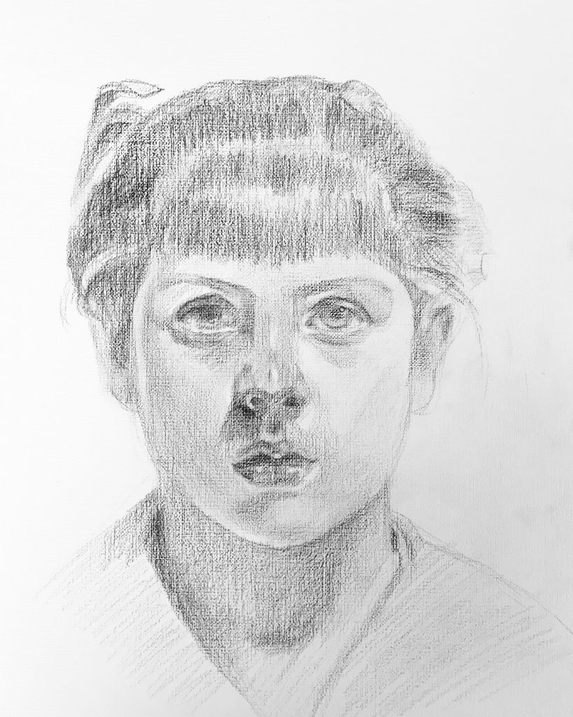
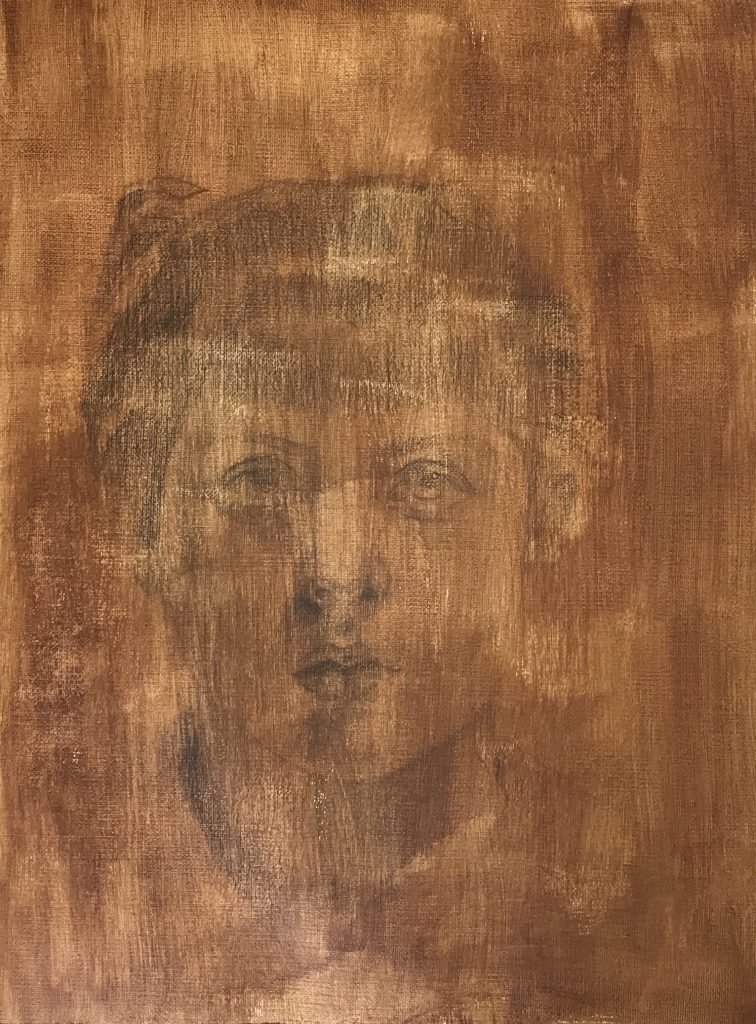
I approached the painting by drawing directly on my canvas paper with a sepia colored pencil.
After my initial drawing was finished, I toned the canvas paper with burnt umber (acrylic). Which didn’t work out so well.. As soon as there’s a brush involved, I have difficulties.
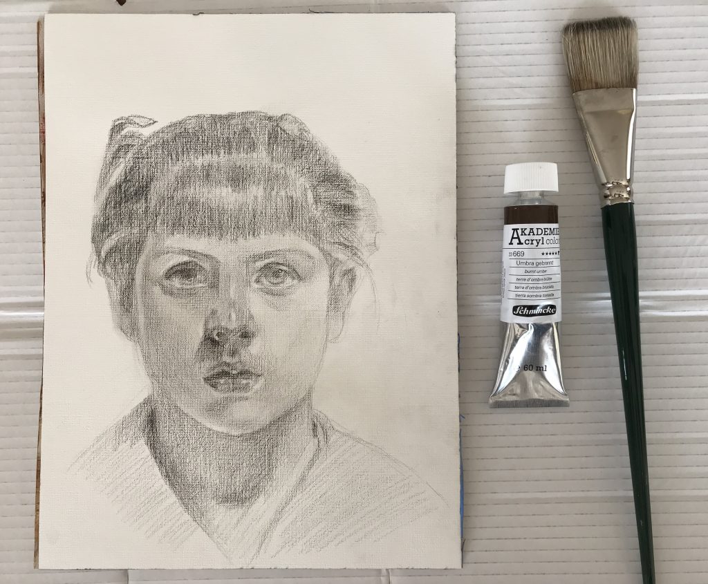
On the next day I started with the painting by choosing my colours. My palette is a glass palette with a neutral gray coloured paper underneath.
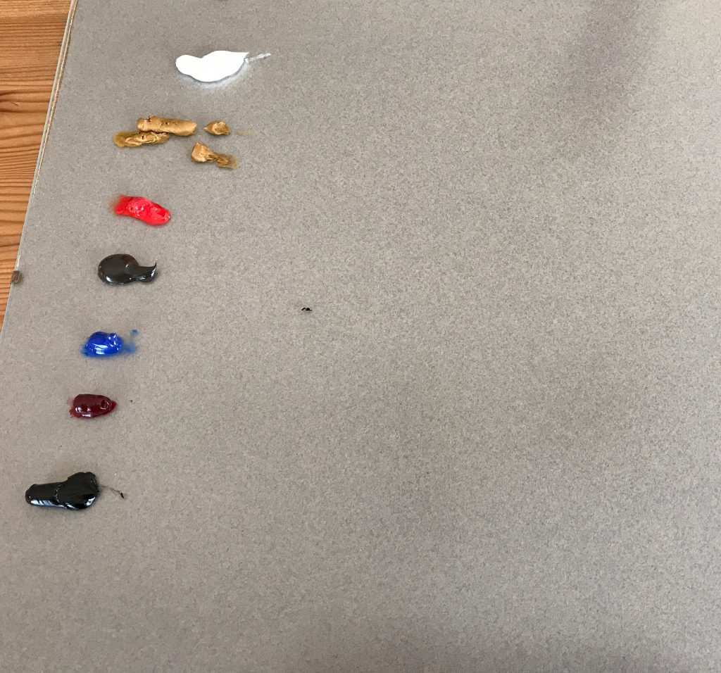
As for the colours, I used an extended version of the Zorn-Palette. Anders Zorn painted sometimes with just four colours, namely yellow ochre, vermilion (cadmium red medium), ivory black and white. You can mix any colour with yellow (yellow ochre), red (cadmium red medium) and blue (ivory black).
On my palette you can find (from top to bottom): titanium white, yellow ochre, cadmium red light, burnt umber, cobalt blue, alizarin crimson and ivory black.
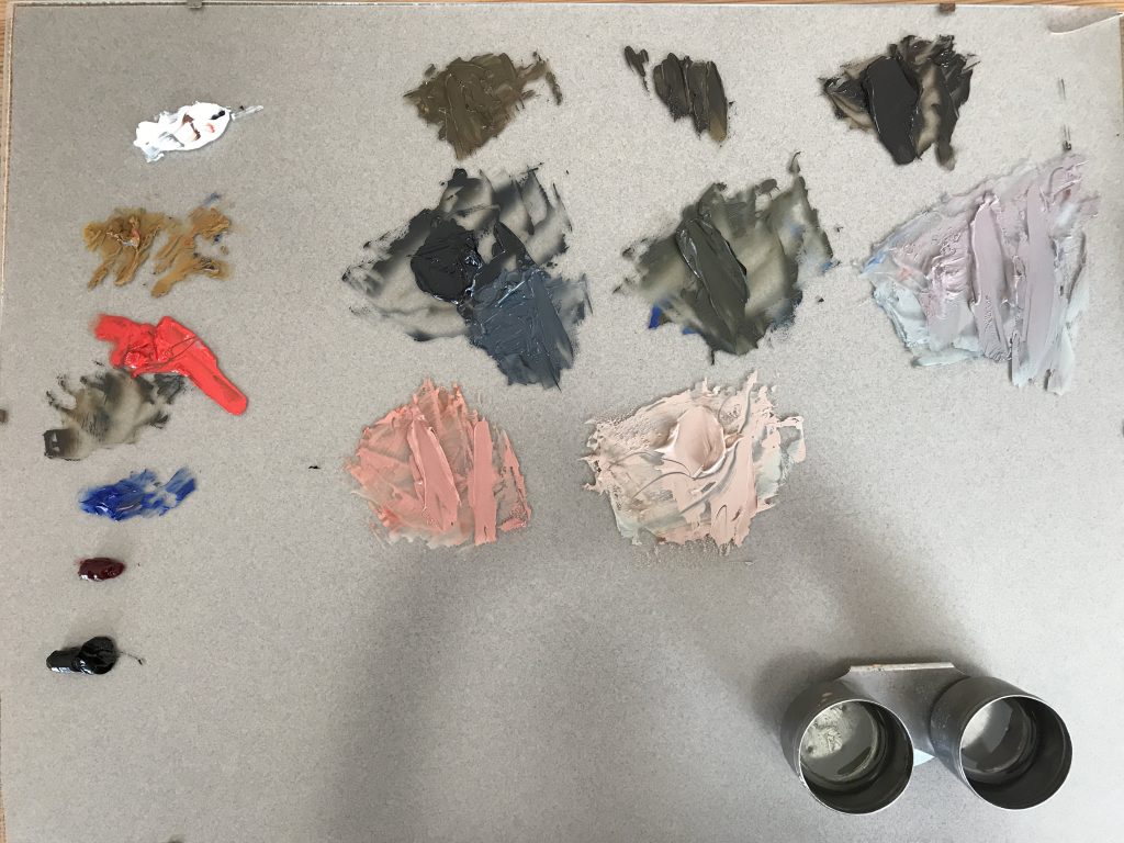
This is how my palette looks after mixing the main colours for the portrait:
As painting mediums I’m using Sansodor from Winsor & Newton and a refined linseed oil from Schmincke. The oil colours are the professional grade colours from Winsor & Newton.
I have to remark, that I was feeling very stressed during the painting process because I very much want to progress as an artist. And I’m very strict with myself…
This is one step of the painting. Notice how cool the colours are. Although the colours of the original painting by Sargent are also cool, I didn’t manage to saturate the colours well. This mostly happens by adding too much white to the colours. It is better to lighten the colours with a yellow tone. However, I did manage to make the colours warmer in the final painting.

The underdrawing was mostly lost while I toned the canvas paper. So it looks a bit different than the original drawing.
And this is my final painting:
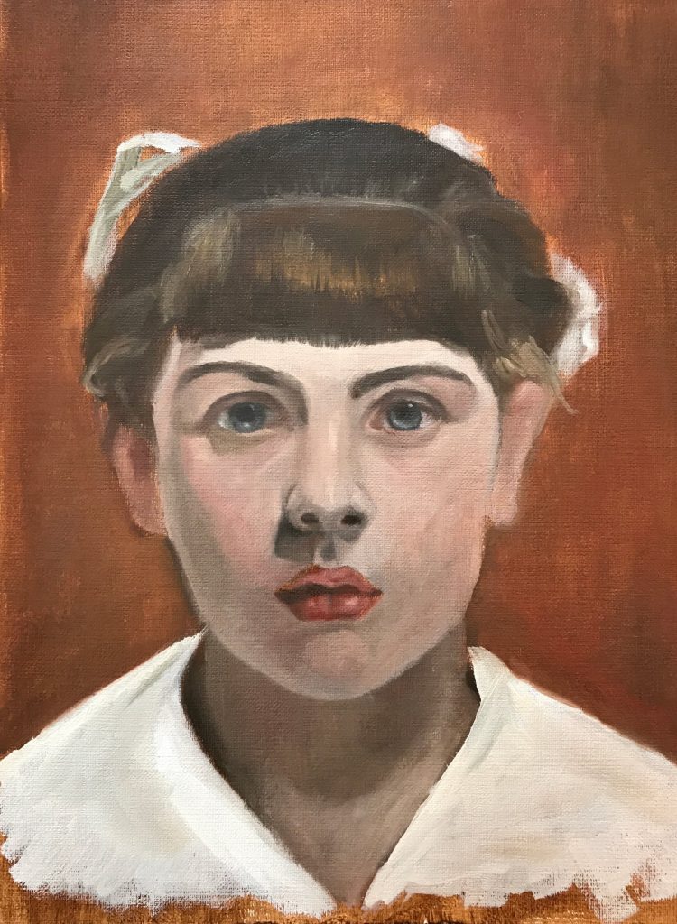
It’s surely far from perfect but I’m happy with it. I did manage to capture the lovely gaze of the girl. Although the colours appear a bit blotchy, they seem mostly correct with regard to hue and value. I did use too much Sansodor at the final stage, which shouldn’t be done. The painting rule is fat over lean. Which means you add more medium to the oil paints at the beginning and use less or none at the final stage. The painting is still wet so I have to take another picture when it dries.
My next step is to paint from a reference picture without relying on the painting of an old master. This means I have to evaluate the colours and their transitions by myself.
Recent Comments